One Eastside
One Eastside
Elevated living, designed to feel like home
Client
PIC
Year
2024
Deliverable
Brand Identity
01
Context
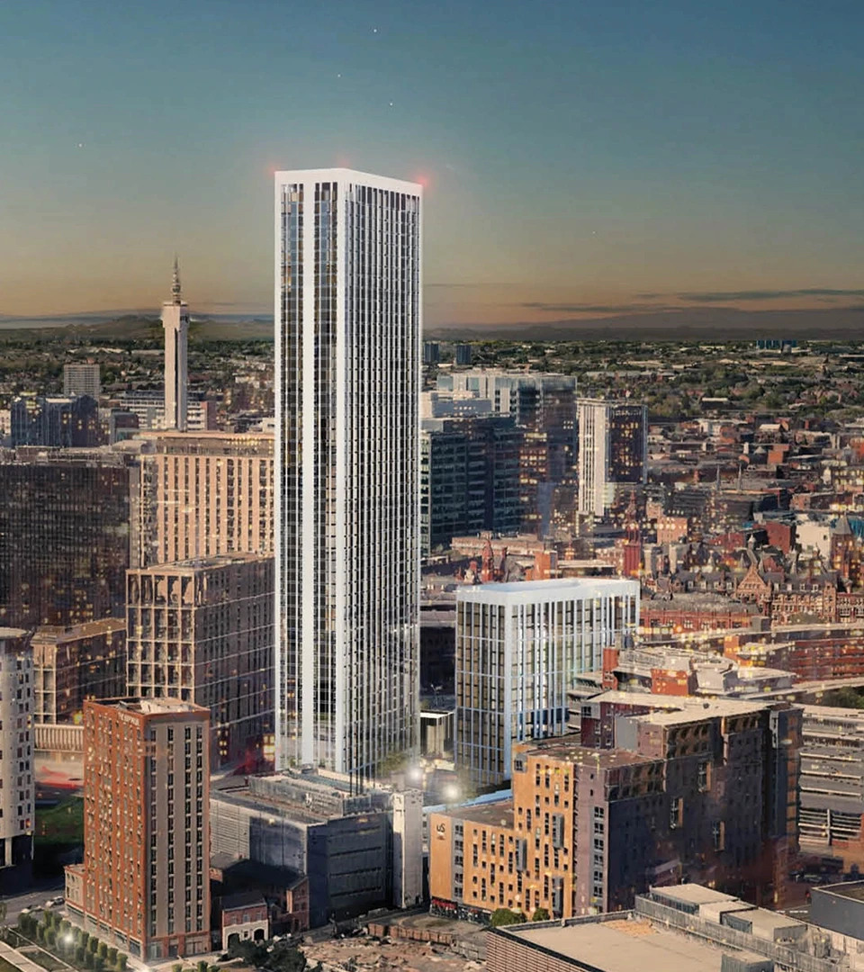
One Eastside is a luxury build-to-rent residential tower, designed to offer elevated living within an architecturally ambitious context.
02
Idea
The construction project was defined by a balance between elevated, engineered attention to detail and the comfort of home - a sense of duality that became central to our conceptual framework. A location rich in historical stories, serving as a canvas for residents to begin writing their own; a bold, modern exterior contrasted against interiors defined by warm terracotta archways and rustic texture; living far beyond utility without being wasteful; luxury that feels like belonging.
03
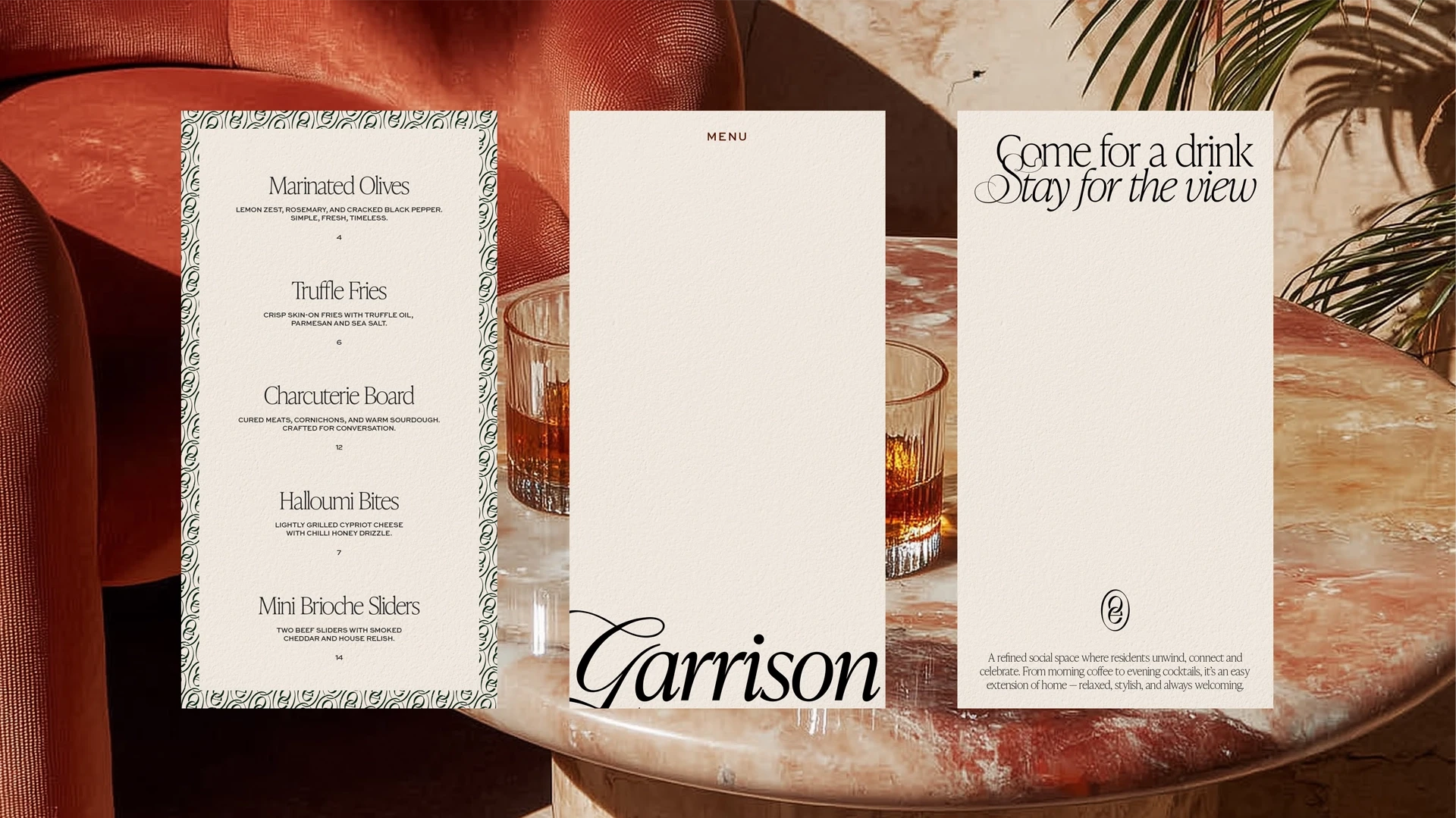
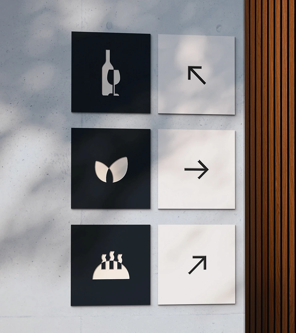
Expression
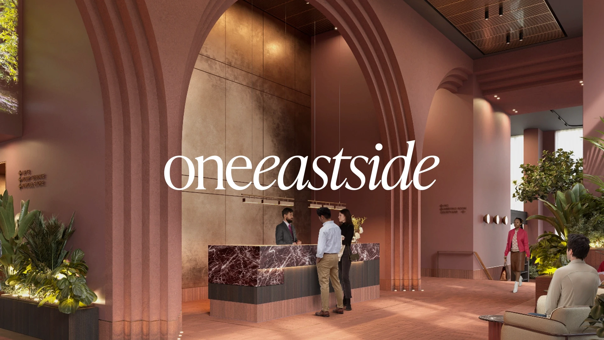
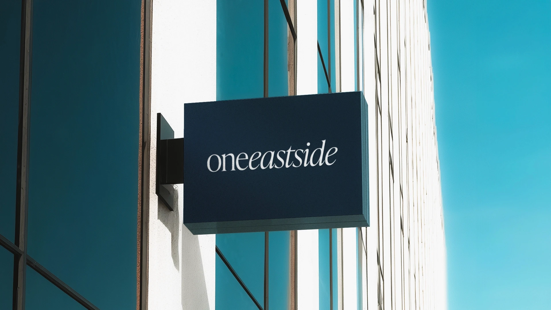
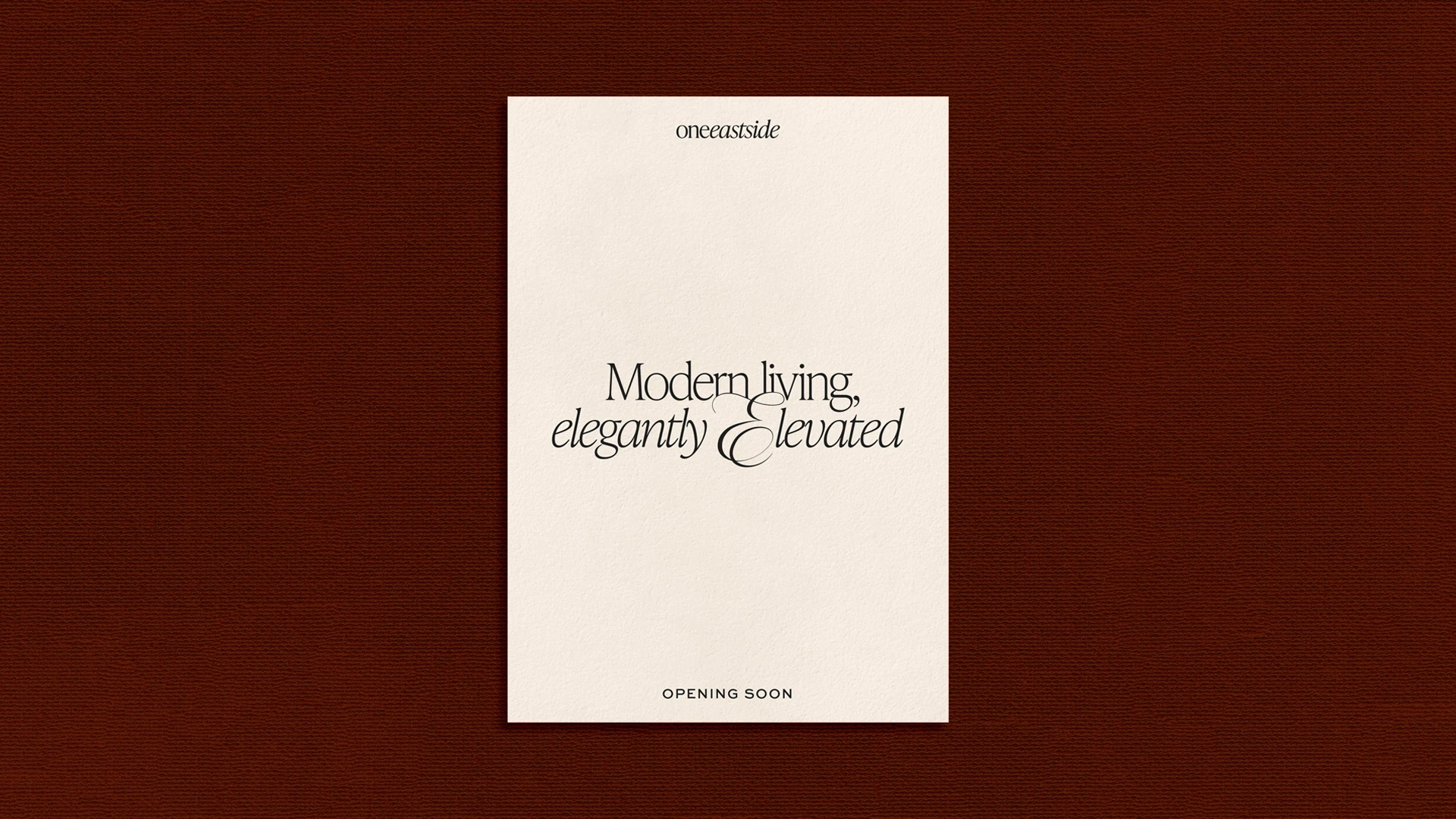
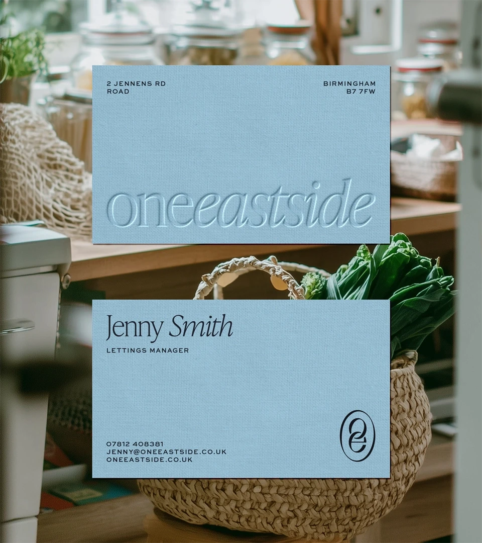
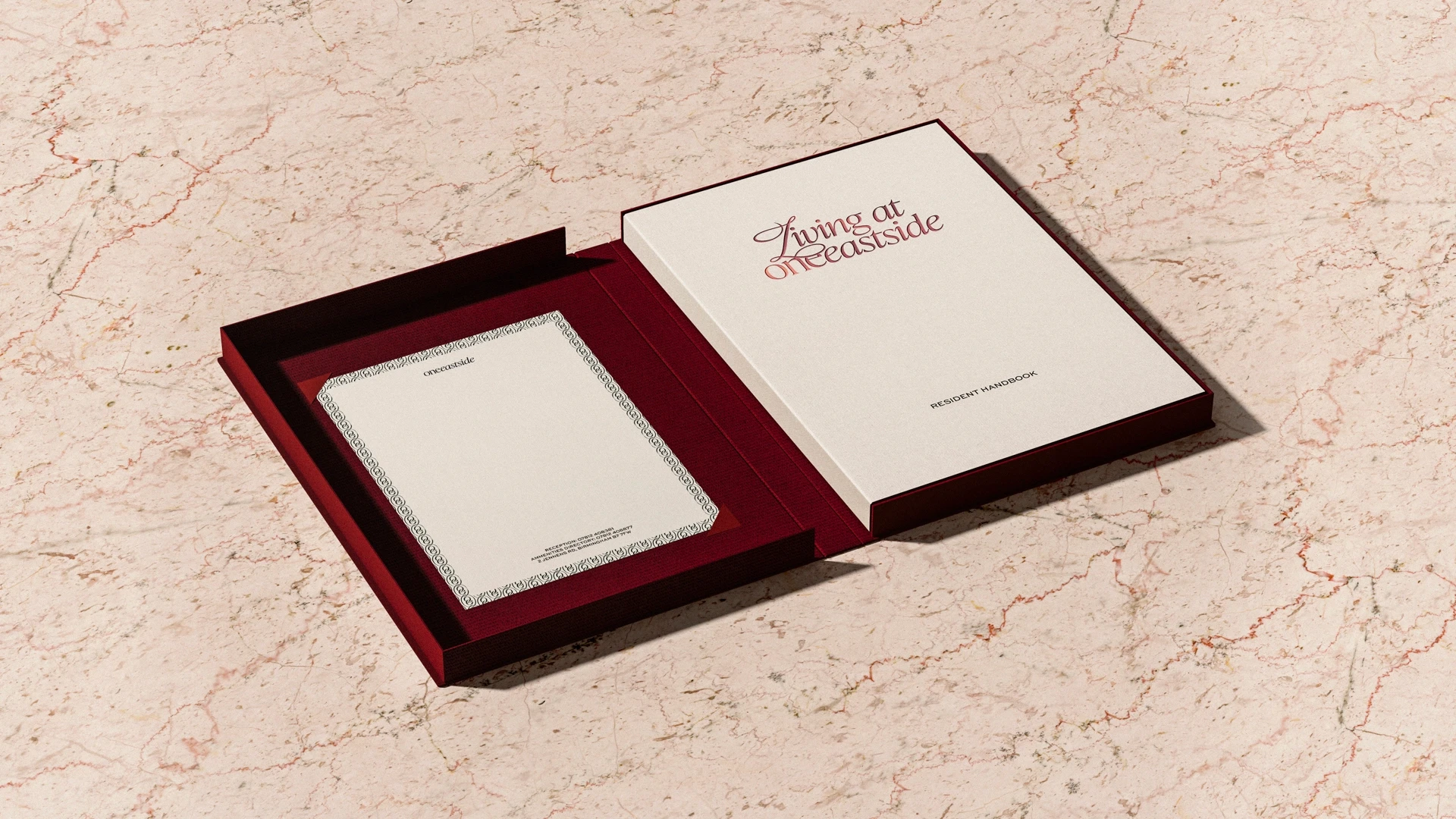
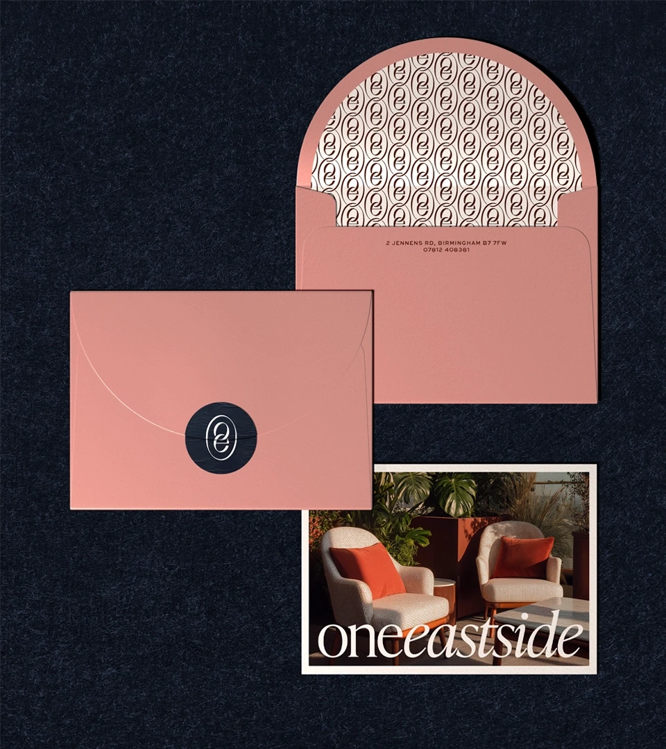
The identity was designed to reflect this balance. Timelessly luxurious cues, like calligraphic flourishes within typography, sit alongside a monogram logo inspired by Birmingham’s industrial heritage. A rich palette grounded by texture and materiality. An art direction described as ‘Signs of Life’ - chosen to present spaces as lived-in, enjoyed, and gently imperfect.
The result is an identity that feels confident yet warm: a composed expression of modern luxury that is quietly expressive and designed to be lived in.
Context
One Eastside is a luxury build-to-rent residential tower, designed to offer elevated living within an architecturally ambitious context.
Idea
Expression


Similar projects